


3
Charred Oak Bourbon Bar Branding

3
Chairman's Bar Branding

3
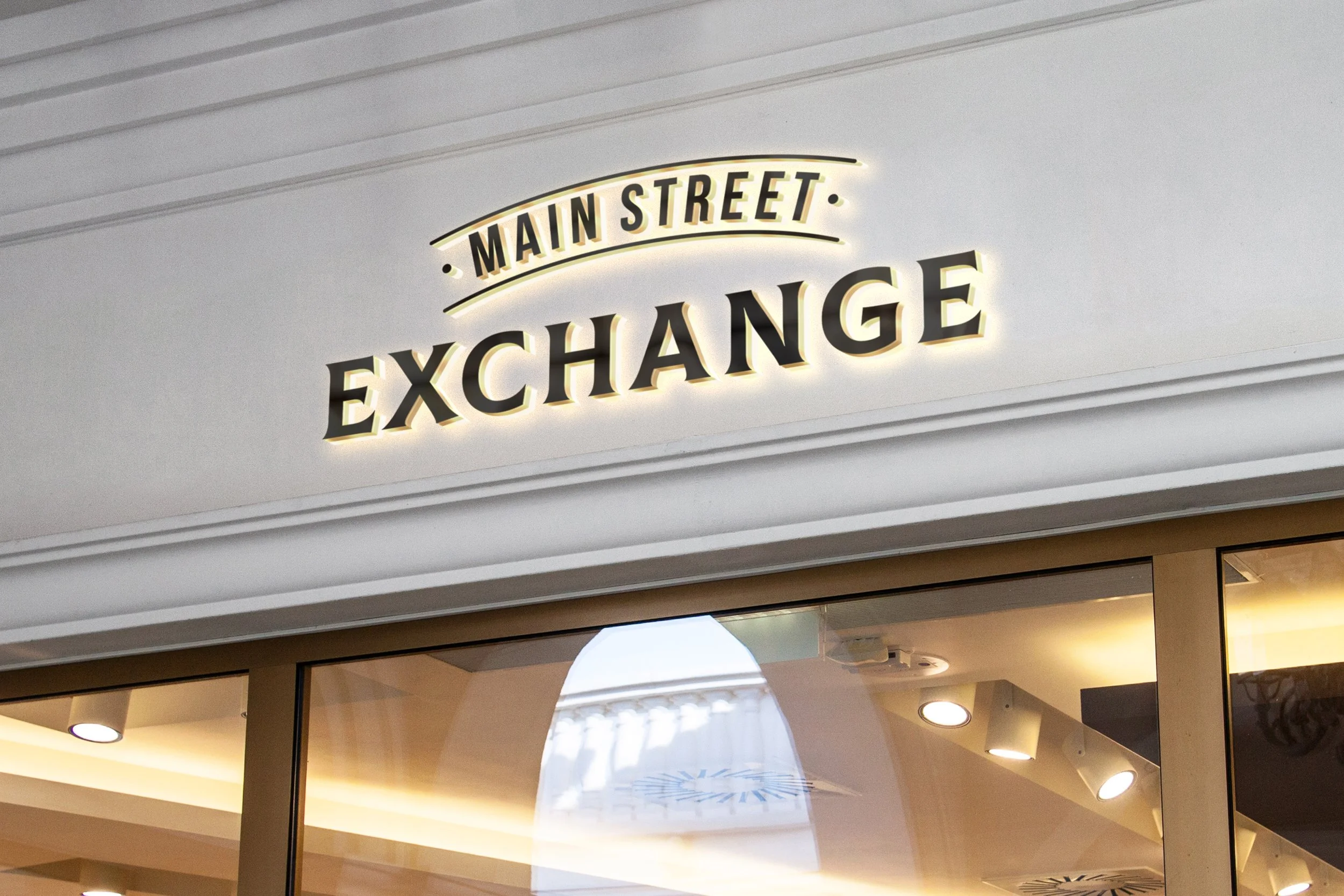
Main Street Exchange Branding

3
Alto Home Inspection Branding

2
Branding & Wine Label Design

6
Sonepar National Campaign

3
Sonepar Safety Month Branding & Campaign

1
Pride Sports Branding & Stationery

4
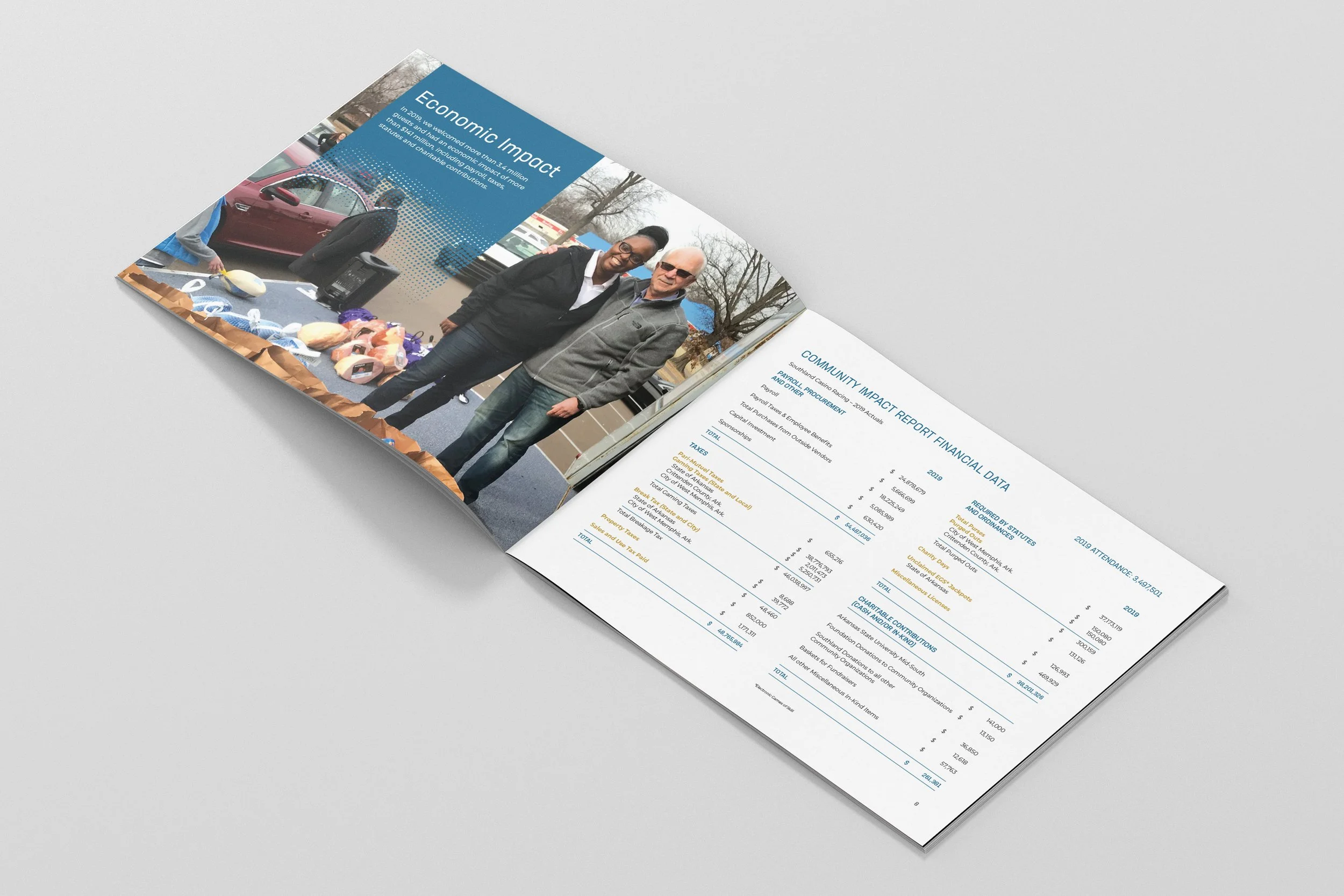
Community Impact Annual Report
1
Deer Park Campground Branding & Promotion
1
Logo Designs for Fisher-Price

1
Casino Promotional Campaigns

1
Lettering Series

1
Wine Branding & Label

2
Fisher-Price® Luv u Zoo Brand Campaign

1
Holiday Party Collateral

2
Integrated Marketing Collateral

2
Collectable View-Master Packaging